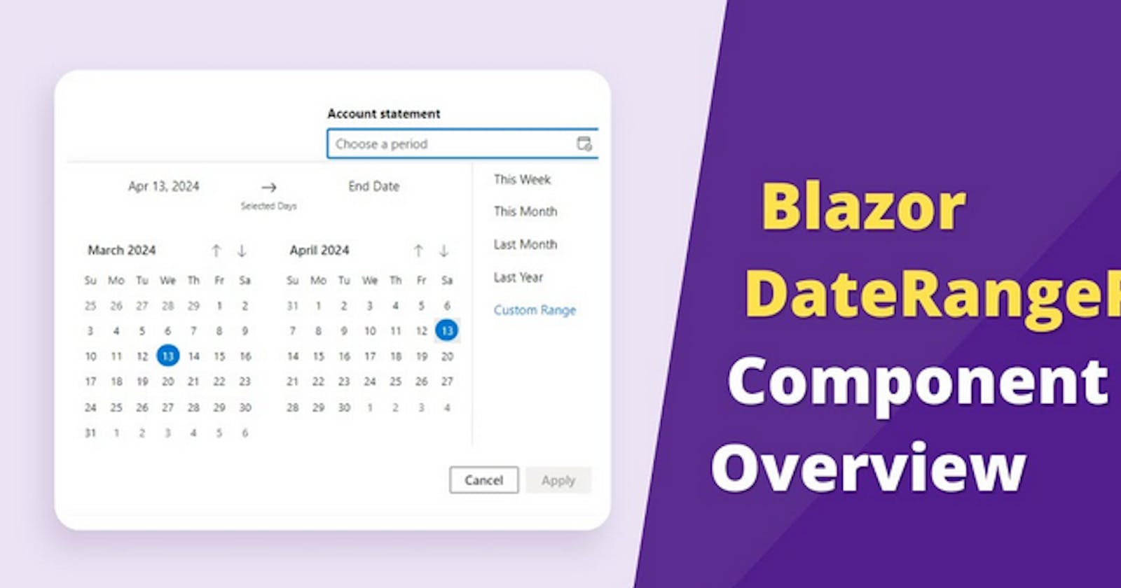
In this video, discover the Syncfusion Blazor DateRangePicker, it is a lightweight and mobile-friendly component that allows end users to select start and end dates as a range from a calendar pop-up or by entering the value directly in an HTML input text box.
With preset ranges, you can quickly select from a list of frequently used custom date ranges, saving you time and effort. Plus, instant validation errors provide real-time feedback when the chosen date range is invalid, ensuring accuracy in your selections. Easily customize your date range selections by restricting dates outside your desired ranges and specifying the minimum and maximum number of days that can be selected within that range.
Our Blazor DateRangePicker offers multilanguage calendar support, allowing you to display dates in your preferred language and format. Customize the layout from right to left and even set the first day of the week for each month to match your application's requirements. Take full control of the Blazor DateRangePicker's appearance with custom CSS styling or choose from our selection of built-in themes to match your application's design seamlessly.
Experience a highly responsive layout and optimized design, with a special full-screen mode exclusively designed for tablets and mobile devices, ensuring a smooth user experience across all devices. Accessibility is key, and that's why our DateRangePicker comes with complete WAI-ARIA support, ensuring compatibility with screen readers and assistive devices.
Additionally, navigate effortlessly through every picker element using keyboard shortcuts, making it accessible to all users. The Blazor Date Range Picker component is also available on other major web platforms: JavaScript, Angular, React, Vue, ASP.NET MVC, and ASP.NET Core.
Product overview: syncfusion.com/blazor-components/blazor-dat..
