

Learn how easily you can add a category axis to Syncfusion Blazor Charts and customize it with various built-in options.
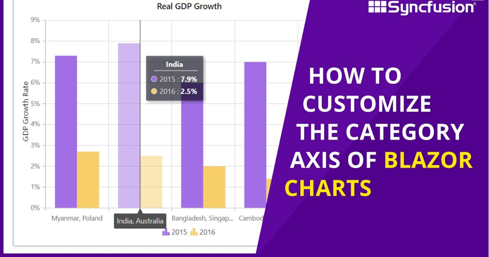
In this video, you will learn how to plot nonchronological data in a Blazor Chart with a category axis. You’ll see how to use available axis customization options like setting custom ranges and intervals, how to position labels on or between the ticks, and how to add the indexed category axis.
Product Overview: syncfusion.com/blazor-components/blazor-cha..
Explore our tutorial videos: bit.ly/2YuFArq
Download this example from GitHub: bit.ly/3aiRsPd